
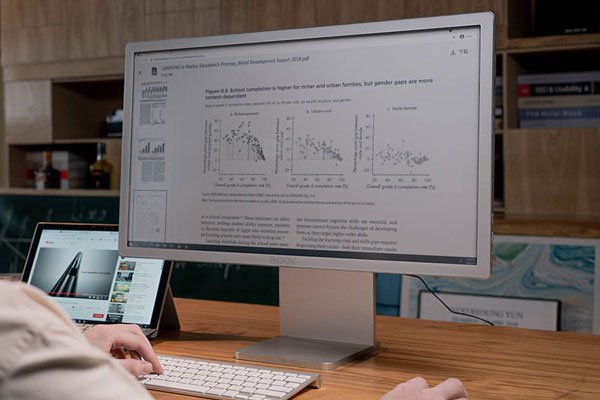
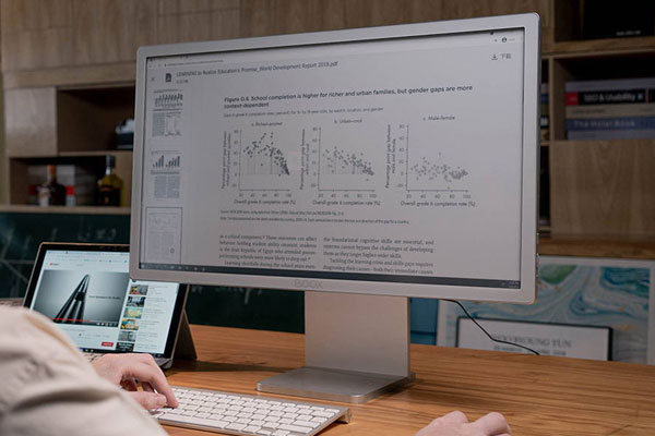
BOOX Mira Pro 25.3″ Color E Ink Monitor – Quick Summary
The BOOX Mira Pro 25.3″ Color E Ink Monitor is a professional-grade display featuring Kaleido 3 color ePaper technology. Designed for developers, analysts, and office professionals, it delivers eye-friendly, paper-like viewing with color support, reducing strain during long work hours.
🧾 Product Overview
The BOOX Mira Pro Color Version is the world’s first 25.3-inch color E Ink monitor, combining 4096 colors, 16 grayscale levels, and ultra-low eye strain technology. Built for productivity, it offers a paper-like display experience while supporting modern connectivity like HDMI, USB-C, and DisplayPort.
With BOOX Super Refresh (BSR) technology and multiple display modes, it adapts to different workflows—from coding and reading to light multimedia tasks—making it a health-focused alternative to traditional LCD/LED monitors.
⭐ Key Features
- 25.3″ Kaleido 3 Color Display – 4096 colors + 16 grayscale levels
- BOOX Super Refresh (BSR) – Faster refresh with reduced ghosting
- Multiple Display Modes – Text, Normal, Video, Slideshow
- Dual-Tone Front Light – Adjustable warm & cool lighting
- Rich Connectivity – HDMI, Mini HDMI, USB-C, DisplayPort
- Ergonomic Stand – Height, tilt, and pivot adjustments
- VESA Mount Support – 75×75mm compatibility
- Built-in Speakers – Integrated audio for convenience
✅ Benefits – Why Choose BOOX Mira Pro Color?
- Protect your eyes → No blue light, no flicker, reduced fatigue
- Work longer comfortably → Paper-like screen for extended sessions
- See color without strain → Ideal for charts, coding, and documents
- Flexible setup → Use as primary or secondary monitor
- Professional productivity → Built for serious workflows
👉 Unlike traditional monitors, this device prioritizes health + productivity, not just brightness and speed.
💼 Use Cases
Perfect for professionals and advanced users:
- 💻 Software development & coding
- 📊 Data analysis & dashboards
- 📈 Financial trading & monitoring
- 📄 Reading research papers & documents
- 🎨 Reviewing designs and layouts
- 🧑🏫 Education and long study sessions
⚡ Quick Specs (Key Highlights)
- Screen Size: 25.3 inches
- Display: Kaleido 3 color ePaper
- Resolution: 3200 × 1800
- Colors: 4096 + 16 grayscale
- Front Light: Dual-tone (112 LEDs)
- Ports: HDMI, Mini HDMI, USB-C, DisplayPort
- Mounting: VESA 75×75mm
- Weight: ~2.9kg
- Audio: Dual speakers
- Compatibility: Windows, macOS, Linux
👁️ How Does This Monitor Reduce Eye Strain?
The Mira Pro uses E Ink technology, which reflects light instead of emitting it. This means no blue light, no flicker, and significantly less eye fatigue, making it ideal for long working hours.
🎨 Can You Use This Monitor for Color Work?
Yes. With 4096 soft colors, it’s suitable for charts, dashboards, coding interfaces, and light design work—though it’s optimized for comfort rather than high-saturation graphics.
🔄 What Are the Display Modes?
You can switch between modes like Text (reading), Normal (balanced), Video (faster refresh), and Slideshow (static content) to match your workflow.
❓ Frequently Asked Questions (FAQ)
Is the BOOX Mira Pro Color good for programming?
Yes, it’s excellent for coding due to reduced eye strain and clear text rendering.
Can it replace a regular monitor?
Yes, it can be used as a primary or secondary monitor, depending on your needs.
Does it support Mac and Windows?
Yes, it works with Windows, macOS, Linux, and any device with compatible ports.
Is it suitable for video editing or gaming?
No, it’s not designed for high-speed visuals. It’s best for reading, coding, and productivity tasks.
Does it have built-in lighting?
Yes, it includes a dual-tone front light system for comfortable viewing in any environment.
What makes it different from LCD monitors?
It uses E Ink technology, which is eye-friendly, glare-free, and flicker-free, unlike traditional screens.
It uses E Ink technology, which is eye-friendly, glare-free, and flicker-free, unlike traditional screens.
🏆 Final Verdict
The BOOX Mira Pro 25.3″ Color E Ink Monitor is a game-changer for professionals who spend long hours in front of screens. By combining color E Ink technology, ergonomic design, and eye-care features, it offers a healthier, more comfortable way to work.
👉 If you want to boost productivity while protecting your eyes, this is one of the most advanced and unique monitors available today.
 No products in the cart.
Reviews
There are no reviews yet.